Hi! We’re Kris and Mikael from the Merpay iOS team, and anzai(@off2white) and shinmiy (@shinmiy) from the Merpay Android team.
This post is for Day 8 of the Merpay Advent Calendar 2022: Mercard Behind the Scenes.
The Holographic Effect for Mercard
Mercard is a new physical credit card from Merpay released just last month that integrates into your smartphone to provide an extra layer of safety and convenience when it comes to managing your spending. Since our users can access their card from within the Mercari app, we wanted to provide a premium experience for the card UI by reproducing the same holographic logo found on the physical card but in digital form. Conventional approaches such as simple PNGs or Lottie animations proved insufficient in recreating the effect, so we opted to instead utilize the gyroscope sensor to map the device’s orientation to the logo color to mimic light reflections bouncing off the physical card when rotating it. Here’s a behind-the-scenes look of how we recreated the Mercard logo in the app.
Recreating the Hologram using the Gyroscope Sensor
To recreate the hologram in the app the gyroscope sensor is first used to gather data about the device orientation, mapping it to a color gradient from an HSB color circle. This gradient then gets masked by the icon to make it appear that the icon itself is reflecting the colors.

[1]: Apple Developer : Getting Raw Gyroscope Events (https://developer.apple.com/documentation/coremotion/getting_raw_gyroscope_events)
The Gyroscope
The gyroscope sensor can measure, in real time, the device position relative to the 3 spatial axes. When the user rotates their device we can measure exactly how the rotation looks in 3D space and send that data to the next stage for color selection. From these readings we can choose the colors and create a gradient color to place over the icon.
Hue Colors
In expressing the color gradation, we needed to determine the color of the icon from the device position. Using an HSB color circle turned out to be the best option for us. We converted the angles of the three axes into an angle between 0 and 360 degrees and mapped this to the current center color.
Planning
The development started as an idea pitch from designers, but it was set aside in favor of other tasks (spoiler alert: there’s a LOT to get done when launching a new credit card!). But as two very talented interns joined the iOS and Android teams shortly after, it just so happened that this type of short-term, independent task was the perfect project for an internship. Asami Kubota and Cai Wenxi were tasked with developing a proof of concept, and they delivered perfectly.
We gathered around and discussed how we can utilize the device rotation sensors and manipulate the icon colors by changing the hue and saturation in relation to the device posture. It didn’t take long to conclude that the idea was feasible and could be implemented shortly after the initial launch. A project team was formed as the idea turned into a full feature project, being a joint effort between designers, engineers, and PMs.

Once the project got started, we tried various patterns to see what looked and felt natural, emulating the holographic logo on the physical card yet still making sure it blended in with the other UI elements displayed on the screen. The team came up with multiple iterations of the icon and tested them on actual devices (we may have gotten some weird looks from other teams during this process, with everyone twisting their arms and neck to look at their device from different angles).
Multiple variables were considered along the way, such as the color scheme, sensitivity of the device, and hue and saturation limits. Sliders were added to the builds so that the designers were able to see how each variable contributed to the overall feel.

We eventually settled with a final product, and ported the implementation from the PoC to our production app.
Energy efficiency
One of the main concerns when implementing a visual effect in Mercari app is that we want to avoid any negative side effects, such as having a device overheat or simply drain the battery faster than normal.
In order to avoid those issues, we addressed the different issues separately.
Motion Monitoring Setup
As previously mentioned, this new feature uses the motion monitoring feature of iOS. This allows us to extract the position of the device in real time, however, if done too aggressively it can use a lot of power.
We tried many different configurations in order to assess which one was the best balance between power consumption and animation smoothness, and ended up setting the data collection frequency to 60 fps. We were also careful to follow Apple’s recommendations by creating a unique instance of the Motion Manager to avoid any data collection issues.
Low Power Mode
On iOS it’s possible to monitor the device’s power mode to know if the user is trying to conserve battery or not.
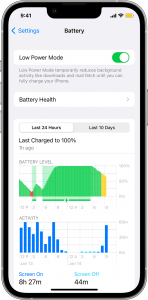
When your device automatically switches to low power mode, or when you decide to switch to this mode manually in order to save battery, we want to make sure that our software does not use features that are power hungry. For that reason, when Low Power Mode is active we disable the Hologram effect and we replace it with a static image instead.
Activate the effect only when necessary
Mercari is a feature rich application because it contains many screens and lots of functionality. One of the main features of the app, Merpay, is currently the only feature in the app where the holographic effect is used, and more specifically only on the Payment tab. But monitoring the device position can occur on any screen within the application, even in the background when unintended.
Because we want to activate the effect only when our users are actually looking at it, we use the SwiftUI lifecycle to turn on or off the effect.
In the following cases we activate it:
- When the Payment tab is active and visible
In the following cases, we deactivate it:
- When the user is not on the Payment screen
- When the user is on the Payment screen but also navigating into a sub screen such as Payment Settings for example.
When we deactivate the effect, we don’t just lower the refresh rate of the motion monitoring, we make sure that it is stopped entirely. Because this effect involves masks and gradients on the UI screen, we also replace the UI with a static image (the same as when in low power mode).
What is special about the iOS implementation?
Implementation
On iOS the user interface was implemented with Apple’s latest UI framework, SwiftUI, rather than the older UIKit. This meant that we could take advantage of Combine and SwiftUI’s Published properties to automatically update the logo gradient colors, angle, and intensity whenever new motion data was received in real time without needing manual intervention.
For the Mercard logo UI we used an image of our logo as a mask to place over our gradient, giving the effect that the logo itself was holographic. SwiftUI provides easy and effective ways to stack and layer views, so the actual view related code was very minimal and quite simple to create. Creating a similar effect in UIKit would require a lot more code related to view constraints and adding subviews, and updating our gradient attributes would have been a more manual and tedious process.
Life Cycle
Since it was important to monitor energy usage to reduce unnecessary battery consumption, the Merpay dashboard screen was monitored to make sure the effect was disabled when it wasn’t displayed. During this process the SwiftUI lifecycle event onAppear was behaving strangely on iOS 14, giving multiple true and false values at unexpected times. Leaving it like that would have kept the holographic effect running in the background in some cases, so we needed to figure out how to fix it. The solution we came up with was to monitor UIKit’s view controller life cycle instead, which led to more accurate readings and kept the effect from being enabled when we didn’t expect it.
What is special about the Android implementation?
Similar to iOS, the Android user interface was implemented using Jetpack Compose. This meant that we could compartmentalize the UI component breaking it off from the other implementations in a relatively concise and simple manner. We use device sensors, however, there is no getting around the Android lifecycle. We split the implementation into two components: a “provider” that receives readings from the sensor and calculates the colors to display, and the actual UI component that receives the color and displays the icon on screen.
Drawing the logo from a state was very easy. Thanks to Compose, this was accomplished with a simple 50 line Composable. If this were to be done using the old View system, this would be much longer with more boilerplate code. The pros of using Compose lies in using feature flags as well. With Compose, we can completely split the implementation using just a simple if statement.
An issue we had along the way was when we were using the emulator to test, we were confused when the emulator rotation display did not match the actual values returned. This was due to the emulator controls rotating the model at the center of the device, but the sensor returning values are relative to the camera position, where the actual sensor is placed.

How do we do Quality Assurance on this project?
On a huge project like Mercari, Quality Assurance is very important to ensure that our users won’t experience bad behavior in the application.
The Quality Assurance team gathers devices and executes scenarios while observing and measuring the outputs.
In this project, because it’s a project that has an impact on the UI and devices’ power consumption, it was necessary to gather different types of terminals for a thorough test.
On both Android and iOS, verifications are done on:
- Old devices: They are often slower than new ones. They are equipped with older chipsets that can potentially get hot when using this feature
- Recent devices: They need to run the new features flawlessly, without overheating and without fps drops. Otherwise, it does not make sense to propose the feature to our users in the first place. Some new devices also show new UI features such as Dynamic Island on the iPhone 14 Pro and it is important for us that our users have a great experience in general but also when using brand new flagship devices from constructors.
- Large screen devices and small screen devices: We choose iPad-like devices to make sure there are no UI issues when using wide screens. We choose iPhone SE-like devices when we want to verify that the UI is working properly on smaller screens.
If the team encounters any issue during those tests, bug tickets are created. Later on, engineers fix the bugs and the QA team restarts the tests execution process.
Conclusion
It was a long journey from original concept to final product, and a lot of talented people came together to create this interactive Mercard logo that we can be proud of to share with our users. Great care was put into this project, as we do with all new features that we bring into the Mercari app, and we invite everyone to try it out!


