
This is vwxyutarooo, an Engineering Manager on the Design System team.
We have recently fully renewed the design system used for Mercari’s app and web development.
In this article, I will introduce the problems we faced with the Design System and the concepts we are using to solve them.
Background
In 2020, we began the development of the Design System alongside our major codebase renewal project called GroundUp. The Design System at this stage was called 3.0 internally.
While 3.0 might sound quite advanced, it includes versions targeting specific platforms and past versions that never saw the light of day due to one reason or another. In essence, 3.0 is the first Design System that is adopted company-wide since the previous versions (1 and 2) are developed but not adopted.
In the lifetime of our Design System of approximately 5 years, we often encountered situations where components created with 3.0 needed to handle use cases far beyond their initial intended design. As a result, many new feature developments could not be implemented using the Design System components, leading to detached symbols with modifications and many unofficial components, called “custom components”, being created internally.
Let me briefly explain why this happened using the example of a component called ItemObject in below.
This component is frequently used across multiple screens. During the 3.0 development, it was extracted as a single component designed to fit a variety of use cases. The component implementation was complex, and several unique elements were displayed or hidden using properties. Internally, we call this a polymorphic API.
As time went on, the necessary elements and required display patterns continued to increase, from further feature development after the 3.0 release.

The problem with this approach is that the number of combination patterns to consider doubles as individual UI optimizations progress.
Furthermore, as the structure deepens, such as element B or C appearing when a specific element A is displayed, the resulting Polymorphic API both increases complexity and reduces maintainability, because we’re trying to solve too many use cases with a single component.

To overcome this situation, we decided to revamp the definition of components and rebuild the Design System with a whole new design philosophy — Atomic Design.
Atomic Design Methodology
Atomic Design is a methodology introduced by Brad Frost that focuses on building web interfaces in a structured, hierarchical way. It emphasizes breaking down complex designs into fundamental elements to create scalable and maintainable design systems. This approach enhances consistency and reusability, facilitating better collaboration between designers and developers.
Atomic Design – Brad Frost
Wait, ain’t Atomic Design dead? Nope, we think it’s still alive.

Brad Frost: Is Atomic Design Dead? – Hatch Conference Berlin 2023
Since there are many explanatory articles and videos, including those by Brad Frost himself, regarding the component decomposition and design methods using Atomic Design, I will omit the details and introduce an example of how the ItemObject was constructed using the 4.0 approach.
As per the theory, each component is divided into its smallest unit of role.
The following image example was treated as one component in 3.0, but 4.0 defines it as a molecule component consisting of two atoms.

By repeating this process, it eventually becomes possible to construct higher-level parts like ItemObject from a collection of smaller, separate pieces. Keeping in mind the fundamental principle of making the UI modular and composed of parts, we provide the assembled, reusable components as molecules or organisms.
For components like ItemObject, where use cases are highly specific and fragmented, we prioritize managing highly reusable and commonly used ones as part of the Design System. On the other hand, for use cases that are less frequent or involve only subtle differences, we intentionally avoid providing complete organisms. Instead, we let users assemble these components directly within the context of their use case.
However, assembling components during use can sometimes impose a burden on users. To mitigate this, we provide examples of assembly methods in the form of "recipes" or "blueprints" to serve as supplementary resources.
We may distribute them as Molecule or Organism components, or we may leave the assembly to the user. As an intermediate step, we sometimes add examples of atom composition patterns in the documentation as recipes/blueprints and have the user assemble them.
We determine whether to create a molecule, organism, or blueprints by considering things like the frequency of component use, the context of use, or the content component dependencies.
Since Blueprints and recipes are concepts unrelated to Atomic Design, I will introduce their content in the next section.

Component Design Strategy
Atomic Design provides a framework for decomposing and constructing components of the Design System, but it does not indicate what should be a component and what kind of components should be managed as the Design System.
In our team, we used Atomic Design for the inward layer from the Design System, and we designed the outward layer independently. The following diagram roughly expresses the layer. The closer to the inside, the more it is the Design System, and the closer to the outside, the less it is the Design System. It is rare to be able to draw a strict boundary in reality, and the boundary is often a gradation, so I intentionally expressed this gradation in this diagram.

Let’s look at each layer in order:
Snowflakes
- One-off components, with limited potential for reuse, due to highly specific content or use context.
- Restrained use is recommended.
Custom Component - A UI component that cannot be expressed by the Design System component specs. These components are detached from symbols or modified beyond the component specs by properties that cannot be constrained on Figma, such as strokes.
- Because the component specs don’t align with the Design System, either the Design System specs should be expanded to add support in the future, or the UI specifications should be adjusted to align with the Design System to thin out this layer.
Blueprint - It literally means blueprint, used in the sense of a design drawing or a completion prediction diagram.
- Blueprints provide a comprehensive design drawing from Figma design data to iOS, Android, and Web source code.
- It is mainly used for things that have strong content/context dependence but are frequently used, or when the assembly method is complicated, although they have a usage close to one-offs like snowflakes.
Design Recipes - Components for which design drawings are provided only in Figma design files. Not provided on source code.
- For things where the need to define them as components in implementation is low, such as receiving the benefits of a framework, they are used as components only in Figma design files for design efficiency (common in layout-related components).
- While Blueprint provides recipes for both design (Figma) and source code, Design Component provides only design (Figma) recipes.
Design System - Independent components that are content/context-independent and reusable.
This layer is deeply influenced by the vocabulary proposed by Brad Frost. Since this does not have an explicit name like Atomic Design, I will simply call it component vocabulary from the expression in the article.

Design system components, recipes, and snowflakes
A design organization where all UI components are completed by the Design System may be said to be the strictest design organization. It is difficult to realize, but there seem to be quite a few such organizations.
This model fits very well when seeking a slightly more rational compromise line. While allowing a certain number of content-dependent components that inevitably occur in product development as one-offs, we can manage them by giving them vocabulary and layers, and create a mindset to keep them thin. And by making things that are reusable but not sufficiently motivated to be managed as a Design System (yet) as recipes that fill the gap between the Design System and Snowflakes, we intend to optimize maintenance costs and returns by giving a gradation to the entire component layer.
Next, we will look at the design and division guidelines for Design System components. As introduced at the beginning, in the previous system, having too many behaviors and variants in one component ultimately led to decreased convenience and maintainability.
Based on these lessons learned, we focused on semantic and simple decomposition in the new system, and set the following four as component design guidelines.
Guidelines for Component Design and Segmentation
Let’s take a look at the design and segmentation guidelines for Design System components. As mentioned earlier, the previous system suffered from decreased usability and maintainability due to an overloading of behavior and variants within single components.
Building on these lessons, the new system emphasizes semantic and straightforward decomposition. The following four points have been established as the core guidelines for component design:
Semantic
"Instead of making components based on visual proximity, we define/divide components based on behavior and semantic classification and always provide consistent behavior."
For example, Mercari has a round, clickable component called a chip.
In 3.0, all were defined as one component, but even though the component looks similar in all cases, the behavior of this component is "overloaded", solving very different design problems with the same visual design pattern.
- Toggle: State changes with tap.
- Removable: Disappears with tap.
- Text Input: Tap triggers another action.
At first glance, they may seem like just different states of a common component, but the tappable area, style on tap, and hover (Web) style are also different. Expressing these with one component requires considering unnecessary dependencies, so by splitting Chip into several components based on behavior, we can avoid the complex unnecessary dependencies introduced at the beginning and improve component maintainability.

Properties
"Can have slight visual variations based on different colors, roundness or squareness of corners. However, it cannot change the shape or behavior of the component."
In the previously introduced chip component, it has a stroke style property like solid/dotted. This is a visual variation and does not change the shape or behavior, so it does not violate the first Semantic guideline.

Optional Elements
"Components can have optional elements (such as optional icons or text)."
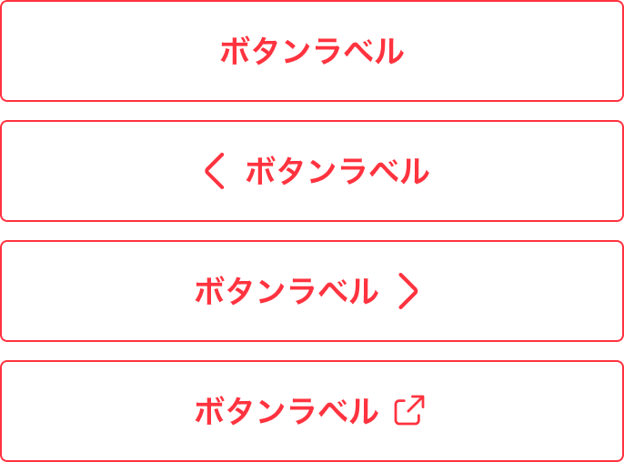
Child elements such as prefix/suffix icons for buttons can be added.
Care must be taken not to contradict the fourth guideline, "No polymorphic API", which will be introduced next.
No polymorphic API
"Should have a consistent API (required properties should not change based on the presence or absence of another property)."
Let’s explain using an image. The following image is a component called ItemThumbnail defined in the old Design System 3.0. In 3.0, only the Large size allowed discount or price elements, but this is considered a polymorphic API and is designed to be avoided in the new guidelines.
"Nested conditions that occur under specific conditions" ultimately lead to the complexity of management as introduced at the beginning.

Code example in Polymorphic API:
ItemThumbnail(
    size = Medium
)

ItemThumbnail(
    size = Large(
        discountPrice = 900¥,
        price = 1,000¥
    )
)
In 4.0, these problems are avoided by decomposing and reconstructing the components. An Organism component called ItemTile is prepared, and Atoms and Molecules containing ItemThumbnail as constituent elements are included.

Code example in non-polymorphic API:
ItemThumbnail(
    leftBottomContentSlot = <other atoms/molecules/organism>
)
Result
Just as a reference, our Design System based on the Atomic Design ultimately ended up consisting of about 150 components, with the component distribution as follows:
Atoms: 50
Molecules: 60
Organisms: 40
Whether this is appropriate or excessive will become clear as more and more teams and projects start using the new system.
Additionally, we were able to avoid creating complex overloaded components and polymorphic APIs. For example the ItemObject example mentioned earlier, we took an approach where the component layout is provided as ObjectLayout, and example assemblies using different parts for different use cases are offered as blueprints.
ObjectLayout:

ItemObject (blueprint):

The bloated code, which once reached about 700 lines on iOS (Swift), has been reduced to under 30 lines. While some code is still generated during the actual assembly, making it not a pure reduction, this effort helped simplify and streamline areas where the abstraction and reusability of components had previously failed.
Conclusion
Through this Design System 4.0 renewal project, we faced past challenges and gained important learnings to evolve into a more flexible and sustainable system.
From the lesson that excessive generalization of components creates complexity and significantly reduces maintainability, we returned to the principles of Atomic Design, dividing components into the smallest units, and shifted to a design that enhances reusability. This allowed each component to have a single responsibility, making changes and testing easier.
At the same time, by rethinking what components should be and rebuilding from scratch, we were able to reflect the knowledge and experience gained in 3.0 into the new system.
Currently, it is in the initial stage of operation, so mid to long-term evaluations will be conducted in the future.
Furthermore, with the automation of design and coding, including Figma AI and Figma MCP, we believe that Design System components that reflect the branding concept and have semantic meaning will increase in importance as a hub and as a provider of context for AI.
We will continue to provide updates if there are any.
Thank you for reading to the end.


