
This post is for Day 8 of Mercari Advent Calendar 2022, brought to you by Williams Kwan from Mercari Core team and Faisal Rahman from the Mercari Architect team.
Intro
Mercari internal design systems power the UI in Mercari web apps. It allows Frontend engineers to implement UI changes quickly by providing UI building blocks. The design system is currently built using Web Components but we are in the process of migrating it to React. This article aims to highlight our migration journey. We hope you find something interesting here :).
Leaving Web Components
What is Web Components
Web components is a set of technologies that allows you to create isolated, custom html elements.
For example, let’s create a custom component called attention-link. Notice that
- We can use this component like any other html element. Great for reusability!
- CSS is scoped to the custom component. No CSS naming collision!
const template = document.createElement('template');
template.innerHTML = `
      <style>
        a {
          margin-top: 20px;
          color: red;
          font-size: 20px;
          font-weight: bold;
        }
      </style>
      <a target="_blank" rel="noopener">Give me attention</a>
      `;

class AttentionLink extends HTMLElement {
  connectedCallback() {
    this.attachShadow({mode: 'open'});
    this.shadowRoot.appendChild(template.content.cloneNode(true));
  }
}

window.customElements.define('attention-link', AttentionLink);
<a>Basic link</a>
<br/>
<attention-link>Attention seeking link</attention-link>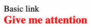
These features allow easy creation and usage of custom components. Mercari web engineers don’t have to think about every single component design. They can simply use custom components to build UI rapidly.
Why we chose Web Components
Mercari as a company has various divisions. Each team is autonomous and are free to choose their tech stack as they see fit. This leads to separate Frontend frameworks being used. For example the marketplace web app is built using React while Merpay uses Vue.
Web Components allows us to build 1 design system library that is consumable by many different frontends with varying frameworks.
Problems with current design system built using Web Components
Lack of usage and contributors
At this point you might think that the same createComponent thin wrapper exists for the other frameworks. The answer is no, React design system package is the only package produced and consumed. Remember how each team has autonomy? This means that each team can choose to maintain their own design system if they wish to do so.
Merpay, for example, does not consume the common design system due to poor SSR and difficulty to maintain Web Components and Vue at the same time.
Lack of usage leads to less contributors which leads to less usage. This feedback loop is hard to change unless we make a drastic change.
Dynamic rendering migration to SSR
Mercari implements dynamic rendering with Rendertron to serve JavaScript-generated content to web crawlers. With dynamic rendering, requests from bots are redirected to server-rendered pages so that they can read JavaScript-generated content well. Over time, we find that the dynamic rendering solution requires significant resources to run and maintain, this was also the same reason Google only recommended dynamic rendering as a workaround, not a long term solution. We looked for alternatives and decided on decommissioning the dynamic rendering service in favor of rendering our pages on the server side for SEO.
Problem then arose with our Web Components. We found that there was no simple way to support server-side rendering of Web Components. We looked into declarative shadow DOM, but the browser support is not ideal as of now; It could not fulfill our browser support policy. Lit labs offers an experimental SSR package, but we deemed it not stable enough for production. We then decided to explore the possibility of moving away from Web Components altogether.
Technical limitations with Web Components
At the time of writing, Web Components also has some technical limitations. This usually stems from shadow DOM causing isolation between components. For example, input-label association across the shadow boundary.
Current design system architecture
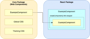
We are using Lit to build Web Components easier. Lit is a lightweight library for building fast, lightweight web components. We then wrap respective Web Components with ourcreateComponent wrapper utility. This produces a React component from the Web Component. Consumers can import components from the React package and interface with them as React components, but clients will see the Web Components rendered on their side.
Migrating to React
As we’ve discussed above, Mercari’s design system is no stranger to React. We already serve React components in a separate package, complete with the tooling. Most of the design system’s consumers use React in their codebase, and therefore consume the React components instead of Web Components as well. We naturally turned towards React to investigate first, we found several key benefits over the current structure.
SSR Support
React offers extensive support for SSR through ReactDOMServer rendering and hydration on the client side. Rewriting the components to React would open up the possibility for migrating from dynamic rendering to SSR.
Promoting collaboration
React is a familiar ecosystem to the engineers in Mercari. Conversely, Web Components and Lit are not widely used across the organization. Moving to a more familiar ecosystem would open up contributions from engineers across the organization, allowing us to adopt a more collaborative contribution model.
Simplified maintenance
We had packages written in two different technologies. Even though the previous React package only implemented a thin wrapper around the web components, bugs and issues may still arise in both packages. Deprecating the web components package will help simplify the maintenance, a crucial point to consider since resources allocated to maintaining the design system are limited.
Migration Process
Steps
Proof of Concept (POC) Project
Migrating a library with 70+ public exports is a huge task. We decided to start with a proof-of-concept (POC) project first to better understand the complexity and to form a solid guideline for migrating all the components. The design system migration project is tightly related to the dynamic rendering migration project, so we decided to kick off with migrating the components used in the SSR POC projects.
We first determined the components to be migrated. We looked at the pages in scope for the SSR POC projects, then we catalog all the components rendered on the client side. Luckily, we could easily do so by walking through the DOM tree, since the web components have identifiable tag names. We then separate the related components into batches to be worked on by individual engineers.
As we worked on migrating the POC components, we documented the lessons learned along with the technical decisions we took, such as how to handle component styling, typing the component events, etc. We also documented the breaking changes introduced by the migration, such as named slots which were replaced by component props. The documents would then serve as the guideline for the actual migration. By having a unified guideline document, new migration contributors can get onboarded more quickly.
Batched migrations
In the POC, we migrated the package in batches of related components. We worked in a shared development branch, from which the batches would branch out. The tooling on the React package is set up to produce a canary release on each commit, so the SSR POC can consume the resulting canary package from the development branch after all the batches have been merged.
Now that the POC project has concluded, we found that migrating in batches is more favorable than migrating all the components at once. Migrating in batches of components lets us assign the tasks more flexibly, and makes the migration process more transparent for interested parties. It will also make it easier for consumers to progressively adopt the new components. We decided to make it even more transparent by creating one ticket for each component, as opposed to one ticket per batch like we did in the POC project.
DX utilities
We have various utilities in place to help with development experience (DX) in the current packages. One of the goals of the migration is to prevent regression in development experience, so we have to migrate the utilities as well. We identified several high priority utilities to implement along with the migration.
First one is documentation generation, or docgen in short. Currently, we run a custom docgen script in the React package which extracts documentation from the wrapped web component. It then writes the information into the React component source file as JSDoc comment, and produces a README file from it. Since the Web Components package will be deprecated, we need a new docgen implementation that is independent from the web components.
Second one is type generation for CSS. The current web components use style injection features of Lit, which won’t be available for the new React components. We had to decide on a new architecture for styling the new React components, which will no longer wrap the web component counterparts. We decided on adopting CSS modules, since the tooling has largely been set up on the React package. CSS modules promote encapsulation by mangling the class names, virtually removing the risk of naming collisions and making the styles difficult to override. CSS modules’ encapsulation ensures UI consistency, a crucial trait for a design system. However, CSS modules require us to prepare type declaration files to accompany the CSS files for the intellisense to function properly on them. Therefore, we determined that we need to implement a way to automate that process, either through a code generation script or installing external libraries.
Difficulties
Managing change request
With any big migration, you will be in a state where you have to support both the old and new version at the same time. Making changes to the old components while a new one is being introduced is difficult. Making small per component migration reduces this window but a policy needs to be in place. So we went with locking changes in the old design system while the component was being migrated. We prepared a spreadsheet which noted the status of each component’s migration. The spreadsheet can be accessed by everyone in the organization, so anyone can figure out easily at any moment whether a component is in migration or not. Which allows people to quickly know whether a component is currently accepting change or not.
Breaking changes
We try to match the current component interfaces as much as possible. However, there are still cases where breaking changes are unavoidable. For example, slots in Web Components does not translate well into the React world. We convert slots into props which results in breaking changes. Since these are unavoidable we try to make the update as smooth as possible. Releasing per component reduces both risk in broken UI and migration time required by the consumers.
Lack of contributors
The migration team is a virtual team. Meaning each member is assembled from different teams. They have other priorities that result in fluctuating contributions to the migration process. While this is a problem, improving DX and moving to React has more than doubled our team size.
Initial results
During the course of migration, we received delightful news from the SSR POC project, which consumes the migration POC components. A stress test was conducted on the SSR POCs, and the result was compared with the dynamic rendering service’s result. Turns out under similar loads, the SSR POC consumes 30x smaller resources. A promising result in latency was also achieved, it’s still unconfirmed yet and further tests may be required, but we’re looking at orders of magnitude faster over the dynamic rendering service. We are confident that the design system migration can help support the transition to SSR to achieve similar numbers in production.
Conclusion
Web Components has served our design system well. However, with limitations we can no longer ignore it is time to migrate to a React based design system. With positive initial results, we are even more confident in the migration’s benefits.
Tomorrow’s article will be by Stephan Donin. Look forward to it!


